Color decisions make or break design projects. The right palette establishes mood, guides attention, creates brand
recognition, and ensures accessibility. Yet selecting colors that work together harmoniously challenges even
experienced designers—and countless tools exist to help.
Color palette tools range from simple generators producing random harmonious combinations to sophisticated
applications managing entire brand color systems. Understanding what different tools offer helps you build a color
toolkit matching your workflow needs.
This comprehensive guide examines the best color palette tools available for designers in 2026, comparing their
features, use cases, and integration capabilities. Whether you’re seeking inspiration, ensuring accessibility, or
managing complex color systems, you’ll discover tools that elevate your color work.
I. Understanding Color Palette Creation
Before examining tools, understanding how designers work with color reveals what tools should accomplish.
Color Harmony Theory
Harmonious color combinations follow relationships on the color wheel—complementary colors sit opposite, analogous
colors are adjacent, triadic colors form triangles. Understanding these relationships helps evaluate whether
generated palettes will work together effectively.
Color Psychology
Colors evoke emotional and psychological responses. Blues feel trustworthy and calm; reds create urgency and passion;
greens suggest nature and growth. Effective palettes align color psychology with intended brand or design messaging.
Practical Constraints
Real-world design requires colors that work across media—print and digital, light and dark contexts, various sizes.
Palettes must include sufficient contrast for accessibility and versatility for different applications.
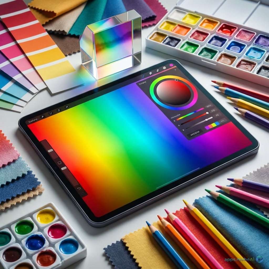
II. Color Palette Generators
Generators create harmonious palettes through algorithms, extraction, or AI.
Coolors
Coolors has become the default palette generator for many designers. Press spacebar to generate random harmonious
palettes instantly. Lock colors you like while generating new options for remaining slots. Adjust individual colors
with precise control.
Export palettes to various formats—CSS, SCSS, Tailwind, PDF, and more. Save palettes to collections for future
reference. Explore trending palettes from the community. Image palette extraction pulls colors from uploaded photos.
Coolors works in browser, as iOS app, and as Figma/Adobe plugins. The free tier offers full generation capabilities;
Pro ($3/month) adds advanced features and unlimited saves. For rapid palette generation, Coolors provides the
fastest, most intuitive experience.
Adobe Color
Adobe Color (formerly Kuler) integrates with Creative Cloud applications. Create palettes using color harmony
rules—complementary, analogous, triadic, and more. The color wheel interface provides visual understanding of color
relationships.
Accessibility tools check contrast ratios for WCAG compliance. Theme exploration shows community-created palettes.
Image extraction generates palettes from photos. Integration with Adobe apps enables direct palette access while
designing.
Free for anyone with Adobe account, Adobe Color provides particular value for Creative Cloud users through seamless
integration. The educational interface helps designers understand color theory while working.
Paletton
Paletton focuses specifically on color wheel relationships with extensive control. Select base colors and harmony
types; the tool generates mathematically harmonious complements. Preview palettes in simulated design
contexts—website layouts, logo applications.
Fine-tuned adjustments control saturation, brightness, and hue within relationships. Export includes various formats
and simulation previews. The focus on color theory education makes Paletton valuable for learning alongside
generating.
Khroma
Khroma uses AI trained on your personal color preferences. Initial setup asks you to select colors you like; machine
learning builds understanding of your aesthetic. Generated palettes then reflect your trained preferences rather
than random harmony.
Infinite generation produces personalized suggestions continuously. Save favorites to collections. The training
approach creates genuinely personalized experience unlike generic generators.
III. Image-Based Extraction
Extracting palettes from images provides inspiration from real-world color combinations.
Image Color Picker
Various tools extract dominant colors from uploaded images. Coolors, Adobe Color, and Canva all include image
extraction. Upload photos—landscapes, artwork, brand imagery—and receive corresponding palettes.
Extraction quality varies by tool. Some identify truly dominant colors; others miss nuances. Compare results across
tools when specific extraction matters.
Palette from Nature
Nature photography provides particularly harmonious color sources—nature’s colors evolved together over millions of
years. Sunset photos, forest scenes, ocean views, and desert landscapes yield sophisticated palettes difficult to
imagine artificially.
Brand Reference Extraction
Extract colors from existing brand materials, competitor designs, or inspiration sources. Use extracted palettes as
starting points for variation and development.
IV. Feature Comparison
Comparing palette tools reveals their distinct strengths and use cases.
| Tool | Best Feature | Price | Integration | Best For |
|---|---|---|---|---|
| Coolors | Speed/Ease | Free/$3/mo | Figma, Adobe | Quick Generation |
| Adobe Color | CC Integration | Free | All Adobe | Adobe Users |
| Paletton | Color Theory | Free | None | Learning |
| Khroma | AI Personalization | Free | None | Personalized |
| ColorHunt | Curated Collection | Free | None | Inspiration |
V. Accessibility Tools
Color accessibility ensures designs work for users with various vision capabilities.
Contrast Checkers
WCAG guidelines specify contrast ratios between text and backgrounds for readability. Tools like WebAIM Contrast
Checker, Colour Contrast Analyser, and built-in Figma plugins verify compliance. Check all text-background
combinations in your palette.
Color Blindness Simulation
Approximately 8% of males have some form of color blindness. Simulation tools show how your palettes appear to users
with various vision types—protanopia, deuteranopia, tritanopia. Avoid relying solely on color to convey information.
Adobe Color Accessibility
Adobe Color includes accessibility tools for checking contrast while building palettes. The integration enables
accessibility consideration during creation rather than after.
Who Can Use
Who Can Use combines contrast checking with vision impairment simulation, showing how many users can adequately
perceive your color combinations. Population statistics contextualize accessibility impact.
VI. Color Management Systems
Beyond generation, managing colors across projects and teams requires organizational tools.
Figma Variables
Figma’s variables system enables comprehensive color management within design files. Define color tokens with
semantic names, organize into collections, and switch entire themes instantly. Variables maintain consistency across
components and enable design system implementation.
Style Guides and Documentation
Document color systems in accessible formats. Include color values in multiple formats (HEX, RGB, HSL), usage
guidelines, and application examples. Zeroheight, Storybook, and similar tools help maintain living documentation.
Color Naming Conventions
Establish clear naming schemes for colors in your system. Semantic names (primary, danger, neutral) enable
understanding across team members. Numeric scales (gray-100 through gray-900) provide systematic organization.
VII. Color Inspiration Sources
Beyond generators, various sources provide color inspiration.
Color Hunt
Color Hunt curates trendy color palettes from designers worldwide. Browse popular palettes, filter by color or style,
and save favorites. The curated approach surfaces quality combinations without generation randomness.
Dribbble and Behance
Design showcase platforms reveal contemporary color trends. Search by color to find designs using specific hues.
Analysis of successful designs informs your own color choices.
Physical World Observation
Beyond digital tools, observing color in nature, architecture, art, and everyday objects develops color sensitivity.
Photograph interesting combinations for later extraction and analysis.
Historical Color References
Color periods in design history—Art Deco palettes, 70s earth tones, 90s neons—provide distinctive reference points.
Historical inspiration creates work that feels fresh through unexpected color contexts.
VIII. Color Workflow Integration
Integrating color tools into design workflows improves efficiency.
Design Tool Integration
Coolors, Adobe Color, and others offer plugins for Figma, Sketch, and Adobe applications. Access palette tools
without leaving your design environment. Import generated palettes directly into design files.
Export Formats
Export palettes in formats your workflow requires—CSS custom properties, SCSS variables, Tailwind configs, JSON, and
more. Direct export reduces translation errors and speeds implementation.
Browser Extensions
Extensions like ColorZilla (Chrome/Firefox) enable color extraction from any webpage. Pick colors from sites you
admire, analyze competitor palettes, and capture inspiration during general browsing.
IX. Advanced Color Techniques
Sophisticated color work goes beyond basic palette generation.
Color Systems
Complete design systems require systematic color approaches—consistent neutral scales, semantic color assignment, and
state variations (hover, active, disabled). Tools like Leonardo help generate accessible color scales
mathematically.
Dark Mode Colors
Dark mode requires different color treatment than light mode—not simple inversion. Background colors need adjustment,
accent colors require vibrance changes, and contrast requirements shift. Plan dark mode during initial color
selection.
Color in Context
Colors appear differently depending on surrounding colors. Test palette colors in actual design contexts rather than
isolation. Adjacent color interactions affect perception significantly.
Cultural Color Considerations
Colors carry different meanings across cultures. White symbolizes purity in Western contexts but mourning in some
Asian cultures. Research cultural implications when designing for international audiences.
X. Color for Specific Design Types
Different design categories have distinct color considerations.
Brand Identity
Brand colors must be distinctive, memorable, and versatile across applications. Test colors in various
contexts—signage, digital, print, merchandise. Ensure colors reproduce consistently across media.
User Interface Design
UI color requires functional considerations—interactive states, accessibility, information hierarchy. Semantic color
assignment (success=green, error=red) follows user expectations. Neutral colors typically dominate with accent
colors directing attention.
Illustration and Art
Artistic color can break rules that UI color must follow. Expressive palettes may prioritize emotional impact over
harmony. Understanding when rules apply enables informed rule-breaking.
Data Visualization
Chart and graph colors require careful consideration—distinguishable categories, meaningful color assignment,
colorblind accessibility. Sequential and diverging color scales serve different data types.
XI. Recommendations by Use Case
Match color tools to your specific needs.
For Quick Inspiration
Coolors provides the fastest path from needing colors to having a usable palette. The spacebar generation workflow
enables rapid exploration. Lock-and-iterate refines results efficiently.
For Adobe Workflows
Adobe Color’s Creative Cloud integration makes it the natural choice for Photoshop, Illustrator, and XD users.
Palettes sync across applications automatically.
For Learning Color Theory
Paletton’s explicit color wheel relationships teach while you work. Understanding why combinations work develops
color intuition applicable beyond any single tool.
For Accessibility Focus
Adobe Color’s built-in accessibility tools enable compliance checking during creation. Combine with dedicated
contrast checkers for thorough verification.
For Curated Palettes
Color Hunt’s human-curated collections provide starting points without generation randomness. Browse until
inspiration strikes, then adapt to your project needs.
XII. Conclusion
Color palette tools have evolved from simple generators to sophisticated systems supporting every aspect of color
work—generation, refinement, accessibility checking, management, and integration. Building a toolkit of
complementary color tools improves both efficiency and output quality.
Coolors stands out as the essential starting point—its speed, intuitive interface, and extensive export options make
it invaluable for palette generation. Adobe Color provides similar capability with superior Creative Cloud
integration. Color Hunt offers curated inspiration when algorithms feel insufficient.
Beyond tools, developing color intuition matters more than any single application. Study color in the world around
you. Analyze successful designs. Understand color theory principles. Tools amplify your color sense—they don’t
replace it.
Your color choices define how work feels and functions. Invest in understanding color deeply, build a toolkit of
helpful applications, and approach color decisions with the care they deserve. Great color elevates good design to
excellent—and these tools help you achieve that elevation consistently.